
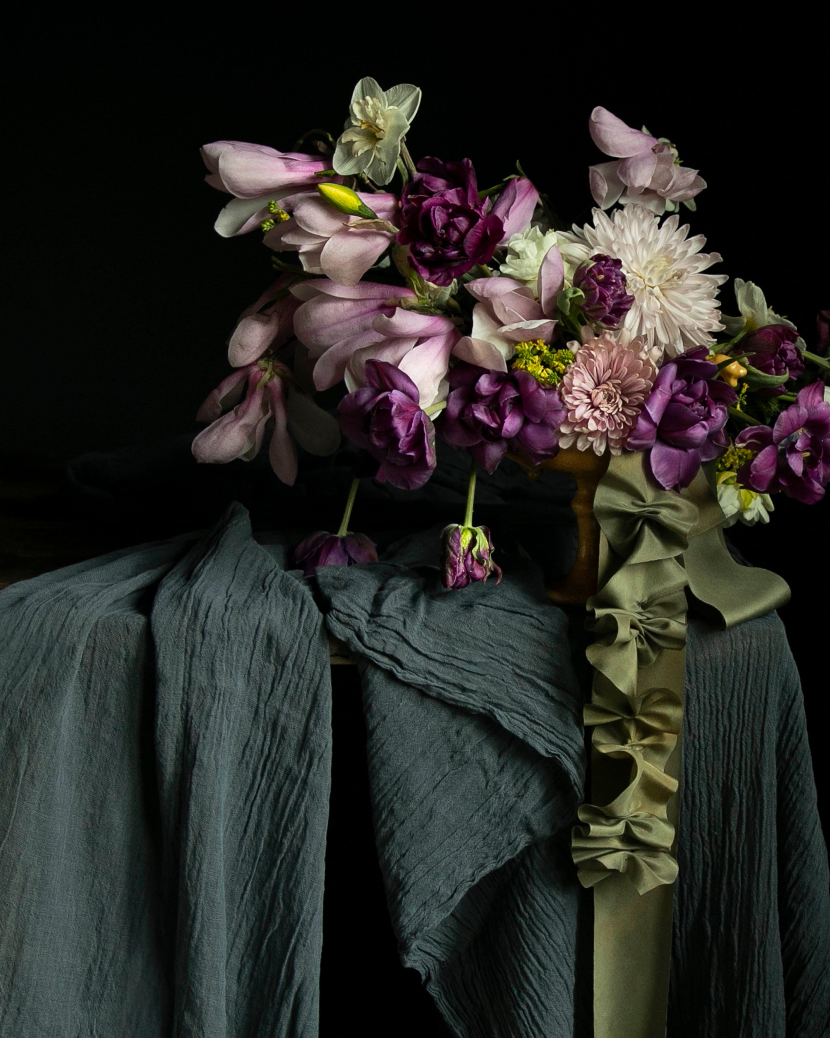

When pairing ribbons and textiles with your floral arrangements, every petal, every leaf, and every shadow holds a conversation. Working with flowers is not just about arranging stems; it’s about telling a story. It’s about creating a sensory invitation and telling your story with colors.
Using a single gathering of blue and purple hydrangeas as an example, you’ll see how the principle of using contrasting colors can change the mood and emotion of a floral arrangement.

The Soul of Color Theory in Nature
Color is alive—shifting with light and changing in relation to its surroundings. This is true in both floral design and naturally dyed textiles. Understanding this dynamic feature of natural color helps us shape the desired mood and emotion. The interplay of tones can transform the narrative of each arrangement, revealing a different story every time.
Color theory is a framework to explain why certain combinations feel vibrant and commanding, while others feel soothing and intimate.
When designing, I focus on the inherent beauty of the blooms and reflect on observations from the wild landscape around me. Here, hydrangeas take center stage. Their petals are a blend of deep blues and rich purples, with a feather white hue hidden on the inner petals. By playing with both the visible and hidden colors, I use ribbons and textiles to express two different narratives expressed with contrasting hues.

The Boldness of Contrast: White Silk Ribbon
Contrast occurs when you pair colors that are far apart, like crisp white against the deep blues and purples. The white silk taffeta ribbon adds instant energy and boldness, commanding attention. This approach highlights individual details, emphasizing their sculptural shape and form. The eye dances between the stark brightness of the silk and the rich depths of the petals. The layer of blue silk on the table disappears behind the florals, making the ribbons feel bold and unexpected.

The Embrace of Harmony: Wine-Colored Ribbon
Harmony is achieved by pairing colors that blend seamlessly, as demonstrated when a wine-colored ribbon draws out the red undertones in the hydrangeas. This approach softens the design, creating a unified, soothing effect that invites closer appreciation. The deep, saturated ribbon doesn’t compete with the flowers for attention. Instead, it speaks the same language, forming a seamless bridge between the flowers and the silk ribbon. Together, they create a harmonious union of contrasting textures, while the white silk draped on the table adds a subtle contrast that highlights the arrangement’s textural beauty.
Choosing Your Color Story
Knowing when to use contrast or harmony gives you the freedom to shape mood: contrast energizes and draws the eye, making bold statements, while harmony soothes and connects, creating a calming, cohesive space. Do you want to awaken the senses, or do you want to soothe them? By thoughtfully considering the emotion you want to convey, you can choose the perfect ribbons or table textiles to bring that feeling to life
Mastering color begins with quiet observation. Taking time to notice the subtle tones, shifts, and relationships among flowers and ribbons allows your arrangements to feel authentic and intentional. It’s this mindful attention that transforms simple materials into meaningful designs with a story to tell.
CREATE THE LOOK: Renaissance Wine Silk Ribbon, Antique White Sheer Silk, Premium Undyed White Silk Taffeta (torn into ribbon), Indigo Organza Fabric (available by custom order)